Landscape Seminar: Exploring Participation Project Data
1. Getting Started
Download a couple of files from the course web site to your R working folder (remember setwd()?). You can do this inside R via
download.file("http://ling.upenn.edu/courses/ling005/ParticipationProject11082014.csv",
             "ParticipationProject11082014.csv")
download.file("http://ling.upenn.edu/courses/ling005/PP4.R", "PP4.R")
Then in R, you should be able to execute
source("PP4.R")
and suitable things should happen -- specifically, that script will make 12 graphs for you, 3 graphs for each of four subsets of the data: for all classes, for SEAS classes, for MATH classes, and for ECON classes. Within each group of three, one shows comments, one shows questions, and one shows "interventions" (= comments+questions). Aside from generating them yourself via the PP4.R script, you can see these as
http://ling.upenn.edu/courses/ling005/ParticipationProject1.png
through
http://ling.upenn.edu/courses/ling005/ParticipationProject12.png
If you look through the file PP4.R in R's editor (or in a text editor), you should be able to see where things happen (if only by following the comments), and then figure out how they happen and how to do new-but-similar things yourself.
Since the PP4.R file has gotten long and over-complicated, you should probably start a new file that just loads the basic data:
###########################################################
# Read in current version of Participation Project spreadsheet
PPcsv = "ParticipationProject11082014.csv"
PP = read.csv(PPcsv)
###########################################################
# Set up column names for convenient reference:
colnames(PP) = c("Class", "Date", "Recorder", "Males", "Females", "Instructor", "Topic",
      "FComments", "FQuestions", "MComments", "MQuestions")
 #
and go from there...
2. Some Initial Observations
We now have 81 data points, and as a result the graphical method of presenting the data that I chose is getting kind of crowded:
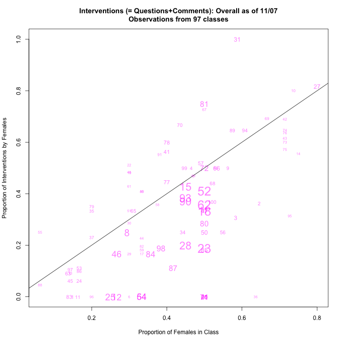
That doesn't mean that we have too much (or even enough) data, but rather that we need to explore other graphical summaries.
Also, quite a few large classes are being estimated as about 50/50 by gender, and so data points are starting to pile up on the x=0.5 line. Again, this is not a serious problem with the data, but an issue for the presentation.
Before we started, one student suggested that questions and comments might behave differently, and indeed it's starting to look as if this might be true:
 |
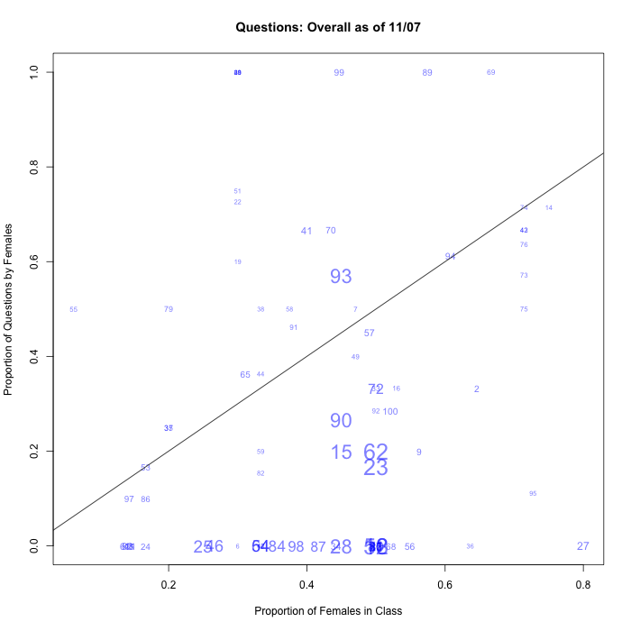 |
So that might be an argument for continuing to tally the comments and questions separately.