COGS 501 -- FDA Homework #2
Data and preliminary analysis
We will use data gathered by Jiahong Yuan for his thesis, in order to explore some of the ideas in John A. D. Aston et al., "Linguistic pitch analysis using functional principal component mixed effect models", J. Royal Stat. Soc.: C, 59 (2): 297–317, 2010.
Our dataset starts with 999 8-syllable utterances from 8 speakers. Since Prof. Yuan's goal was to model F0 contours (using an interesting technique different from the one being explored here), the utterances were composed of all voiced sounds, including a minimum number of voiced stops and as many nasals, liquids and glides as possible. A typical utterance:
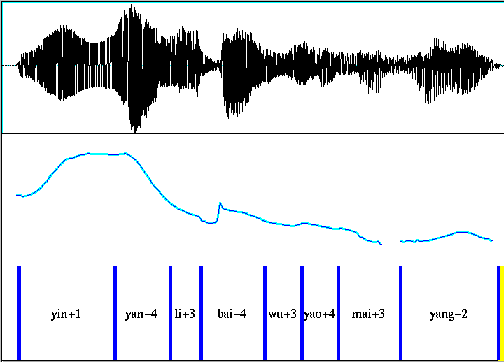
Each recording was supplied with a syllable-level segmentation, as shown in the Praat screenshot above.
I pitch-tracked all of the original .wav files (using the ESPS get_f0 function), pulled out the time-samples corresponding to each syllable, and re-sampled these sequences so that each one had exactly 30 sample points (using linear interpolation between adjacent values in the original to approximate required samples that fell "in the cracks"). I did not try to interpolate across stretches where the pitch-tracker failed to return a value, but just left a nominal value of 0 in the result in those cases.
The result of this procedure was a matrix of 7,992 rows (syllables) and 30 columns (f0 sample sequences). A corresponding text file is available as all.f01 -- we can read it into Octave or Matlab as follows:
f0data = load('-ascii', 'all.f01');
Now we want to eliminate rows with zeros in them -- it would be better to interpolate across the regions where pitch was not tracked, but it's simpler to leave this out for now.
zerorows = (min(f0data')==0);
f0data1 = f0data(~zerorows,:);
nvals=length(f0data1(:,1))
There are 7,101 rows without zero values, so we've lost 7992-7101=891 syllables, which is too bad but tolerable for now.
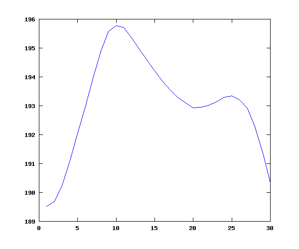
Now let's plot the overall mean (syllable-level) contour, which (plausibly) shows lower values near the consonantal margine, and an overall down-trend, all within a fairly small compass of about 6 hz in 190, or about 3%:
f0means = mean(f0data1);
plot(f0means);
Another matrix, this one 7,992 by 10, contains indicator variables for the 7,992 syllables (presented in text form in all_ind.f0). The columns are:
% 1 speaker
% 2 statement(0) or question(1)
% 3 sentence has focus? 0=no, 1=yes
% 4 focus location (if any): syllable 1, 5 or 8
% 5 tone category of the focused syllable (if any) 1, 2, 3, or 4
% 6 sentence "group" (1 to 8)
% 7 location of the current syllable within the phrase (1 to 8)
% 8 frame number of the first f0 sample in the original sentence contour
% 9 frame number of the last f0 sample in the original sentence contour
% 10 tone category of the current syllable (1 to 5)
f0inds = load('-ascii', 'all_ind.f0'); f0inds1 = f0inds(~zerorows,:);
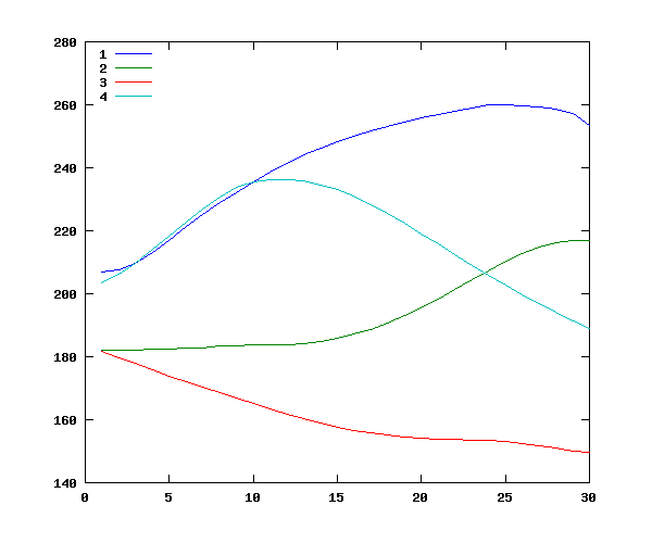
We can use this matrix of indicator variables to check a few main effects. For instance, we can look at the overall mean contours for the four tones:
tonemeans=zeros(4, 30);
for tone=1:4
 tonemeans(tone,:) = mean(f0data1(f0inds1(:,10)==tone,:));
end
plot(tonemeans')
legend(' 1',' 2',' 3',' 4','location','northwest')
This gives plausible overall values for tone 1 ("high"), tone 2 ("rising"), tone 3 ("low"), and tone 4 ("falling") -- especially since the distribution of contexts is non-orthogonal:
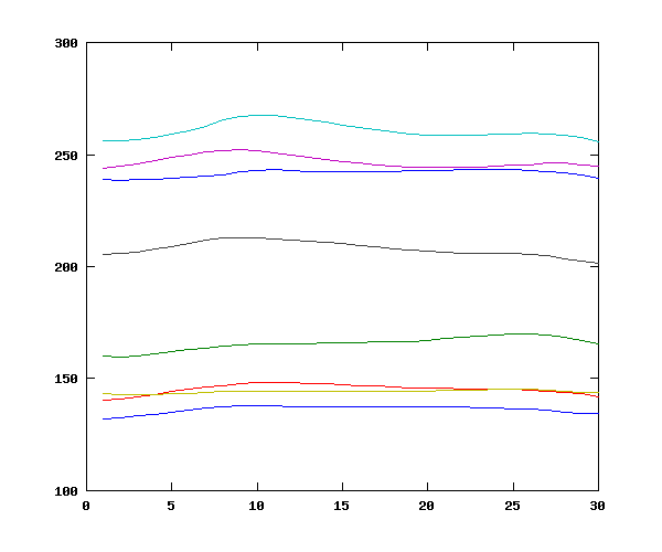
Now we can do the same thing for the main effect of speaker:
speakermeans= zeros(8,30);
for speaker=1:8
   speakermeans(speaker,:) = mean(f0data1(f0inds1(:,1)==speaker,:));
end
mean(speakermeans')
     ans = 241.67   165.70   145.40   260.69   246.93   144.19   207.97   136.32
plot(speakermeans');
Again, this gives plausible results, consistent with the presence of four male and four female speakers:
Let's examine the interaction between speaker and tone, comparing tone 1 and tone 3 for the speaker with the highest mean f0 (speaker 4) and the lower mean f0 (speaker 8). This yields the plausible result that speaker 8's "high" tone is lower than speaker 4's "low" tone, confirming the need for some normalization:
speakermeans= zeros(8,30);
for speaker=1:8
   speakermeans(speaker,:) = mean(f0data1(f0inds1(:,1)==speaker,:));
end
stm=zeros(8,30);
stm(1,:) = mean(f0data1((f0inds1(:,1)==4) & (f0inds1(:,10)==1),:));
stm(2,:) = mean(f0data1((f0inds1(:,1)==4) & (f0inds1(:,10)==3),:));
stm(3,:) = mean(f0data1((f0inds1(:,1)==8) & (f0inds1(:,10)==1),:));
stm(4,:) = mean(f0data1((f0inds1(:,1)==8) & (f0inds1(:,10)==3),:));
yrange = [min(min(stm))-10 max(max(stm))+10];
figure(1); newplot();
subplot(1,2,1); plot(stm(1:2,:)'); title('Speaker 4'); ylim(yrange);
subplot(1,2,2); plot(stm(3:4,:)'); title('Speaker 8'); ylim(yrange);

As is often the case, there's the question of what the appropriate "graph paper" is. Should we normalize by subtracting a constant value? or by using a log transform, which would turn constant ratios into constant differences? One way to examine this is to look at the relationships between corresponding portions of two different speakers mean time-functions for various tones. That is, we plot the first value for speaker 8's average tone 1 against the first value for speaker 4's average tone 1, the second value against the second value, and so on. This gives us something like this:
stm(5,:) = mean(f0data1((f0inds1(:,1)==4) & (f0inds1(:,10)==2),:));
stm(6,:) = mean(f0data1((f0inds1(:,1)==4) & (f0inds1(:,10)==4),:));
stm(7,:) = mean(f0data1((f0inds1(:,1)==8) & (f0inds1(:,10)==2),:));
stm(8,:) = mean(f0data1((f0inds1(:,1)==8) & (f0inds1(:,10)==4),:));
figure(2); subplot(1,1,1); newplot();
plot(stm(1,:),stm(3,:),'b*',stm(2,:),stm(4,:),'ro', stm(5,:),stm(7,:),'gx', stm(6,:),stm(8,:),'k+',yrange,yrange,'k-');
xlim(yrange); ylim(yrange);
xlabel('Speaker 4'); ylabel('Speaker 8')
legend('Tone 1','Tone 3','Tone 2','Tone 4','location','northwest')
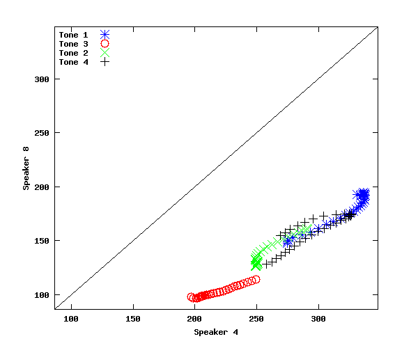
In the plot we've just made, the points are not parallel to y=x (as they would be if there was on average a constant additive difference between speakers), but neither do they fall along a line of constant slope and 0 intercept (as they would if there was on average a constant multiplicative difference between speakers).
We can check for this more directly by plotting one speaker's values against their ratio to corresponding values for another speaker:
figure(3); subplot(1,1,1); newplot();
plot(stm(1,:),stm(1,:)./stm(3,:),'b*',stm(2,:),stm(2,:)./stm(4,:),'ro', stm(5,:),stm(5,:)./stm(7,:),'gx', ...
     stm(6,:),stm(6,:)./stm(8,:),'k+');
xlabel('Speaker 4'); ylabel('Speaker 4 / Speaker 8');
legend('Tone 1','Tone 3','Tone 2','Tone 4','location','northwest')

In that plot, you can see that the ratio is not constant, but rather falls over quite a wide range (roughly 2.15 to 1.75) as the basic pitch increases. This suggests an additive component in the relationship, which would cause the ratio to shrink in this way.
On the other hand, a direct check of an additive relationship also fails badly:
figure(4); subplot(1,1,1); newplot();
plot(stm(1,:),stm(1,:)-stm(3,:),'b*',stm(2,:),stm(2,:)-stm(4,:),'ro', stm(5,:),stm(5,:)-stm(7,:),'gx', ...
     stm(6,:),stm(6,:)-stm(8,:),'k+');
xlabel('Speaker 4'); ylabel('Speaker 4 - Speaker 8');
legend('Tone 1','Tone 3','Tone 2','Tone 4','location','northwest')
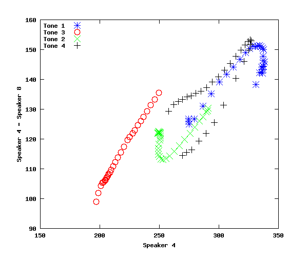
Again, the difference is not constant, but increases with increasing f0 -- suggesting a multiplicative component in the relationship.
Question 1: How to model speaker-related pitch-range effects.
We've just seen that neither an additive model nor a multiplicative one is likely to be correct (which is not to say that such models would not fit quite well, as in the case of the tree-weight data...).
1(a): Would the problem be fixed by using a semitone scale?
N.B. A semitone is a 1/12 of an octave, and an octave is a ratio of 2/1, so a semitone is a ratio of
2^(1/12)
In order to turn a value V in hz to a value in semitones, we have to pick a base value B and then calculate x such that
V/B = (2^(1/12))^x
Thus x = (log(V)-log(B))/log(2^(1/12))
1(b): What if each speaker's f0 values were a linear function of some underlying scale, with possibly different slope and intercept? That this could yield qualitatively similar results is shown below. Could such a model fit quantitatively? What would it mean?
Vhat = .01:.01:1.0; NN = length(Vhat);
V1 = 50*Vhat + 50; V2 = 100*Vhat + 150;
yrange = [0 max(V2)+10];
figure(1); subplot(2,2,1);
plot(1:NN,V1,'bx',1:NN,V2,'ro');
xlabel('Time'); ylabel('Pitch'); legend('V1','V2','location','northwest');
subplot(2,2,2); plot(V2,V1,'rx',yrange,yrange,'k-');
xlim(yrange); ylim(yrange);
xlabel('V2'); ylabel('V1');
subplot(2,2,3); plot(V2, V2./V1, 'rx');
xlabel('V2');ylabel('V2./V1');
subplot(2,2,4); plot(V2,V2-V1,'b*');
xlabel('V2');ylabel('V2-V1');

1(c): What about z-score normalization? (That is, representing each speaker's pitches in terms of standard deviations above or below that speaker's mean.) What does this predict qualitatively about these scaling relationships? What happens if you fit such a model quantitatively in this case?
Funtional Principal Components
Now we can try the method for finding "eigencontours" (or "functional principal components") used in the Aston et al. paper, which is to look at the eigenstructure of the covariance matrix. We will find that the five eigenvectors with the largest eigenvalues look quite a bit like the first few orthogonal polynomials in the last exercise:
f0cov = cov(f0data1);
[V L] = eig(f0cov);
LL = diag(L);
% Note that eigenvectors are in columns of V
%  with eigenvalues ordered from smallest to largest
basis5 = V(:,30:-1:26)';
figure(1); plot(basis5'); title('Five eigenvectors')
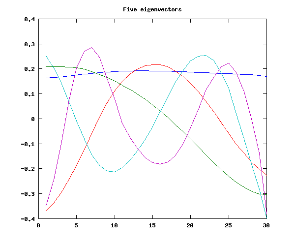
We will find that these five eigenvectors do quite a good job of approximating (a sample of) the original contours:
for n=1:6
coeffs = basis5'\f0sample(n,:)';
synth = basis5'*coeffs;
subplot(2,3,n);
plot(1:30,f0sample(n,:),'b',1:30,synth,'r');
end

Four components do nearly as good a job; three is a bit worse, and two is marginal.
Next:
A. This type of (hz-based) FPCA for speaker-tone interactions, vs. using other sorts of "graph paper"
B. Using the results of FPCA for solving classification problems (e.g. via Fisher discrimimants)
C. The results of FPCA as independent or dependent variables in regression